

RADIANT
The Challenge
Developing the mark for Rakuten’s proprietary Design Language System.
The name was chosen by a multidisciplinary panel that considered a range of conventions for naming systems, including thematic, utilitarian, structural, linguistic, and value-based marketing logic.

RADIANT, stands for Rakuten Americas’ Design, Interface, and Navigation Technology. The acronym complements Rakuten’s thematic and aspirational naming conventions. Rakuten, for example, is the Japanese word for “optimism.” There is so much potential for both “radiate” and “radiant” to be the modifiers, enhancements, or byproducts of optimism.
Design Inspiration

light, logic, engineering

components, gestalt

innate luminosity

catalyst, potential

inspiration, emanation, beginnings

energy

the sublime
Conceptual Themes


Ideation & Drafts


The Design


Light shone through a keyhole
RADIANT is the key to Rakuten’s design success and a central hub for the product’s design truth and knowledge. Light embodies the clarity and ideation facilitated by RADIANT, passing through a shape derived both from the Rakuten “R” and a keyhole. The clean, architectural references to square, circle, and triangle connote creative possibility. Simple foundational components come together to form a more significant whole. The logo is both abstract and a figurative metaphorical depiction. The simplicity of the mark provides a timeless composition and universality, but also scalability to multiple use cases.
Variations


Color
The Palette is derived from the brand’s official purple and tints and achieving at least 3:1 AA contrast accessibility rating.

Typography
The typography uses the company’s global sans serif font, Rakuten Sans UI, with a customized R glyph.

Cohesion
I wanted the mark to feel familiar and cohesive both to the Rakuten logo, but also to the tooling platform that powers the product design, Figma.

Architecture
The mark’s primary shape derives from the company logo, centering and padding are based on structural ratios.

Clear space & Kerning
It was important to base elements like clear space and kerning on the fundamental architecture of the mark so that spacing could be determined by ratios independent of specific units of measure.

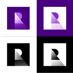
Inverse & 1-color
The mark needed to solve for display on light and dark surfaces and also singe color passes.
Scaleability
The design needed to look pleasing large, but recognizable and coherent at small scales.
